It has long been noticed that the colors that surround him have a huge impact on a person’s emotional state, as well as on his well-being and psychological mood.
Psychology experts believe that brown shades are calming and help restore psychological balance. Canvases of such colors will certainly help you create an original and stylish design any room. To avoid dullness and gloom, designers advise combining dark and light palettes.

Room with brown canvases
Most people believe that chocolate color is dull and a room decorated this way will certainly be gloomy. However, if you combine the wallpaper brown With light furniture, you can get a harmonious atmosphere.


For deep color, it is enough to choose the “ideal friend” and the interior will turn out incomparably beautiful.

Selecting wallpaper
When choosing brown wallpaper, you need to be extremely careful. A small room overloaded with this color will seem even smaller.

Combination with white
This combination can be considered the most ideal. With such a union, snow-white will expand the room and visually increase its space. When decorating in such colors, you need to add a little variety, in the form of colorful details, to avoid the dullness of the interior.

For small rooms, feel free to choose white and brown wallpaper, they will visually increase the size of the space, and the room will look much more spacious.


Union with pastel shades
To create a warm and relaxed interior, choose this combination. This union is perfect for a living room or bedroom. In the hall, designers successfully practice the technique of accentuation. This is when coffee wallpaper is glued to only one wall, and the other three walls are decorated in pastel shades. Bright decorative items will fit perfectly into such an interior.

A rich bedroom decoration can be created using chocolate colors or with gold motifs. Beige-brown wallpaper will make your apartment warm and welcoming.

Blue notes
The combination of these colors will make the room cold and dark. This design solution suitable for rooms located on the south side.

For a children's bedroom you should not use a lot of brown; here you can and should add blue. For example, the playing area can be highlighted in blue.

Duet golden and brown
Designers consider this union to be the most sophisticated and chic. These colors complement each other. In the sunlight, the walls shimmer with gold. Using this combination, you can emphasize the wealth and status of the homeowners.

Yellow wallpaper goes well with brown. Using this combination you can create a beautiful room with a cozy atmosphere.

Combination with green


Brown-orange mood
If you want to get an energetic atmosphere without losing warmth and comfort, feel free to decorate the room in these colors. Light-colored furniture is perfect for such an interior.

Duet with lilac
By choosing such a duo to design your room, you can achieve a calm and relaxing atmosphere. A bedroom made in this style will help you unwind after a hard day and will always set you up for a pleasant rest.

Features of using these shades
Shades of brown have different intensities. Therefore, there are quite a few alternatives for its use. When using brown wallpaper in the interior, you need to pay attention to some features:

- Rich chocolate, without sufficient lighting, it seems dull and gloomy.
- When choosing dark wallpaper, you need to choose more quality models. They last longer appearance and are more resistant to mechanical damage.
- To create such an interior, it is imperative to use bright accents.
- In a large room use dark brown wallpaper. In tiny rooms, give preference to light brown wallpaper.
- Massive patterns should be used only on one wall. A large drawing can greatly “saturate” and overload the room.
- Beige or white-cream furniture is perfect for chocolate canvases.

Wall color with brown furniture
Chocolate-colored furniture goes well with brown fabrics if you add a few other colors to the room. Green, yellow or cream decorative elements will do this perfectly.


Chestnut-colored furniture harmoniously combines:
- Pale gray It will bring rigor to the interior and will be able to slightly expand the space.
- Milky shades also visually increase the space and add softness to the room.
- Add a romantic mood, create cozy interior the color of coffee with milk will help.
- Unique and stylish house can be achieved using golden shades.

A large number of photos of brown wallpaper in the interior can be seen in the portfolio of any designer. The noble color can be used to decorate a room in any style. Don't be afraid to make bold decisions when creating the style of your home.

Photo of brown wallpaper


You can talk at length about canons in design, but every day the existing canons are becoming less and less stable. Aesthetics and harmony, balance, colors, materials brought together in order to obtain such a long-awaited result are the essence of your knowledge, practice and self-development. My motto is to learn, see, touch something new every day, and I am sure that this is the only way to stay on the right course in “high design.”
“Life in chocolate”, some in this phrase will see a carefree prosperous existence, while others modern interior. If you consider yourself to be in the second category, join me, let's talk about how to use chocolate color in the interior.
“Edible” color can have many shades, from rich cocoa color to dark brown, bordering on black. Whatever tone you choose, they are all connected with the material world.

Color psychology defines chocolate as the color of people who stand firmly on their feet, honor their roots, care about their well-being and live a measured, quiet life. Is the color itself really so dull and monotonous?
No. He is amazing, able to find a lot of color duets and arrange a truly cozy interior.
Color duets
White and chocolate

White is universal in nature and forms an excellent companion to rich brown. In the interior, it is preferable to give at least 2/3 of all large surfaces to white. If this combination seems too boring, introduce a third color, such as gold, orange or turquoise.

A few words about beige
Beige is much softer than white and belongs to a variety of light brown shades. Such a duet is self-sufficient, so it can exist without a third color. But you can afford a varied play with textures in the decoration of walls and furniture.

The combination itself is reminiscent of a delicious chocolate cake. What's missing in dessert? That's right, fruit! For accessories, choose berry shades, such as lingonberry, pink, apricot, plum or blackberry.

What do you think about red?
Red is sharpness, strength and energy, brown is calm, without additional color they are unlikely to be able to create a sufficiently harmonious interior union. Dilute them with blue or white accessories.

Orange sun, orange camel
Orange is no less energetic, but more appropriate in a duet with chocolate. Remember, the darker the chocolate shade, the brighter the orange should be. Use white as a complement.

Yellow sun
Yellow and chocolate are quite close on the color wheel. In a duet with dark brown, I recommend using soft, blurry shades of yellow. For small rooms, the latter can be the main color.

The photo shows a combination of chocolate-colored textiles and bright yellow upholstery
The grass is turning green
Both colors are classified as natural, so they go well together. Green brings coolness and freshness to the interior, creating a contrast with the cozy and warm chocolate. For country-style interiors, I would recommend using shades, but for classic and art deco, rich emerald is suitable.

Blue and chocolate
If by all means you want to add blue in the interior, choose muted shades - bleached blue, pale cornflower blue, niagara and gray.

The combination of chocolate and turquoise, as well as the duet of reddish-chocolate with a hint of blue denim, is especially popular.

Despite the fact that black is considered neutral and even classic colors, I do not recommend combining it with chocolate.
As a result, you may end up with a rather gloomy and inexpressive interior.
Gold – to be or not to be?

This combination is suitable for classic interiors and large areas. As an addition, you can use light shades - cappuccino, beige, cream, champagne and ivory.
Pink Panther

Pink and chocolate evoke thoughts of retro; the color tandem is appropriate in bedrooms and children's rooms. In most cases, pink takes the reigns in the room, while dark brown is used in furniture and accessories.
Chocolate is most rarely combined with gray, purple and dark blue.

Chocolate and creamy bedroom

- A feature of the room allocated for the bedroom was an extremely modest amount of daylight. natural light. That is why the design emphasized subdued artificial lighting.
- Chocolate was chosen as the main shade; the color duo was creamy. The choice is not accidental and is dictated by the fact that dark shades of brown do not require large quantity light, are able to start an amazing game even in dim lighting.

- Another feature of the room layout is low ceilings. The problem was solved by using moldings, vertical picture frames and clear lines of curtains. In addition, painting the ceiling cornices in the same tone as the walls had a positive effect.
- What helps create the illusion of spaciousness in a small room? Of course, this is the measured use of large objects. So, a floor lamp, a leather chair and a bed with large drawing at the head.

- The location of the door and window did not allow me to radically change the layout, but I worked on the functionality. In addition to two spacious built-in wardrobes, storage space was created in the bed, equipped with a lifting mechanism.
- The panels that frame the niche located behind the bed are made of chipboard; synthetic padding is “hidden” under the fabric with a geometric print.

- Parquet modules with the Versailles ornament, an original chandelier on the ceiling and, of course, reproductions of paintings gave the room a special mood.
- If you are arranging the interior in a small area, choose built-in appliances. In this project, I “recessed” the TV into the wall, after moving the niche forward a few centimeters.

- A separate area was a loggia-office with a heated floor system. The same shades were used for its design – chocolate and cream.
Used:
- fabric – “Artik” Fabricut;
- wall paint – Vinyl Matt Dulux;
- moldings – Axxent PX144, Orac;
- decorative panel – “Toris”;
- built-in wardrobes – “Capital Carpentry Company”;
- parquet – Marco Ferutti;
- built-in ventilation – Ventmachine.
Expressive interior in brown and blue tones
Sometimes even a small thing can become a starting point in interior design, and this is what happened with the arrangement of the kitchen. You will hardly guess what became the “trigger mechanism”. Roosters, however, are drawn. The main shades of the interior were chocolate, blue and red.

Long and not so much comfortable room Not only three bright and self-sufficient colors fit in, but also many textures. Rough granite, smooth plastic, stainless steel and natural wood.
At first glance, associations are created with the works of the Cubists. This is not surprising, because the kitchen is ruled by strict geometry and clear lines, visible in the kitchen island, shelf, hood and even refrigerator. The only element that was not absorbed by geometry was the collection of paintings.

Thanks to the complex geometry of the kitchen island, it was possible to divert attention from the narrowed space and low ceilings.
The lighting deserves special attention. In addition to classic spot lighting, atmospheric shelf lighting appeared in the kitchen. A slightly “cubic” mood is also created by sconces that cast clear cones of light on the surface of the walls.

The many textures used coexist in one area due to repetition. For example, natural wood panels successfully coexist with the stone countertop, as they are reflected in the finishing of the ceiling and floor.
The kitchen island made of black granite resembles an art object and serves as a full-fledged dining table for the whole family. For a light snack and tea drinking there is a small bar counter located near the stove.

The brown and blue color scheme was not limited solely to the kitchen and found its continuation in the living room. The furniture includes a velvet Togo Ligne Roset sofa and an impressive set of armchairs and a sofa made of genuine leather in a rich chocolate color. Instead of a carpet, the living room has a parquet board with an ornament.

Used:
- bar stool – Ligne Roset;
- kitchen – Alno;
- lamp – Masiero;
- sofa – Togo Ligne Roset.
Chocolate in blue wrapper

The main shades of the interior were coffee and milk, chocolate, blue and light blue.
The living room walls are painted, the floor is solid oak. In this project, I decided to move away from my favorite geometry, so I chose classic furniture with a slightly rounded shape.
Accessories and decor in a washed-out blue color were reflected in the textiles.

The hall is separated from the kitchen by a portal without a door, which makes the rooms almost a single whole, turning it into a kitchen-living room.
In window decoration, in addition to classic curtains, wooden blinds were used. This decision is explained by the location of the apartment, which allows you to watch amazingly beautiful sunsets. The light of the setting sun penetrates the slats, falling expressively and architecturally on the surfaces.

The main style of the interior is classic, but this fact does not prevent the kitchen from looking modern and containing considerable functionality.
Classical high plinth, cornices and ceiling rosettes successfully coexist with laconic glossy facades and straight lines of metal handles.

From the kitchen you can see the soft blue hall, the design of which combines classical and ethno motifs. Unlike the kitchen-living room, the walls of the hall are covered with wallpaper, which fits perfectly into the overall concept of the project.

Used:
- sofas – MERIDIANI;
- textiles – HARLEQUIN;
- lamps – Isa Corsa;
- chairs – KA International;
- table – MERIDIANI.
The perfect home for a chocolate lover
Finally, I want to show you a house that, by my personal standards, I consider ideal for “chocolate” lovers. Why him? Its design is bright, unusual and even a little surreal. At first glance, it brings to mind the house of Salvador Dali in Figueres.

The main rooms are dominated by autumn colors - chocolate, burgundy and gold.
The living-dining room is filled with the spirit and elements of ethnicity, art deco and minimalism. I think an artist, sculptor, or simply a wizard would be very comfortable in such a house.
The furniture in the living room not only performs a functional task, but is also an art object, just like a table with tentacle legs. The ethnic theme continues in the wicker round mirror and two bone flowerpots-lights.

In the dining room special attention worthy are paintings that are, on the one hand, an abstraction, and on the other, an engraving.
The kitchen is made in the best traditions of an eclectic interior: light, neutral and as spacious as possible.
Used enough interesting technique– covering the floor and tabletop in the same color.
This move is relevant for both large areas and small kitchens.
It allows you not to visually split up the space.

The hall resembles an art gallery, filled with photographs and graphics. Just one painting in an ocher tone allows you to combine the black and white corridor with the rest of the rooms in a warm “autumn” color scheme.
Here, the most varied items come together in an amazing way: an African couch, Asian chairs and a pair of lamps with root legs.

Remember, I said that chocolate goes well with gold. In most cases, the role of the first violin is given to dark brown, and golden is reflected only in decor and accessories. But there are also reverse combinations.

Thanks to its special texture flooring and wallpaper surfaces at a certain incidence of light rays appear golden. Why not, especially if we are talking about a spacious office.

Guests of the house will also be treated to “chocolate”; this particular shade was chosen as the main one for decorating the walls in the guest room. A bright accent is a sofa in ultramarine shade. A cabinet with a glossy surface can slightly increase the modest area of the room.

The main style of the bedroom is ethnic, made in a pleasant coffee-beige color. Such a light tone of the walls became an excellent backdrop for contrasting light furniture: bedside tables, sofa, table lamps. The accent role was taken on by a fur blanket, a carved wooden headboard and a stone mask on the wall.

Rich chocolate-graphite walls emphasize the sophistication of natural white marble, from which the sink and bathtub are made.
Conclusion
Chocolate color can easily claim the title of the most cozy and warm shade. I'm sure you'll enjoy "living in chocolate." How do you feel about using dark shades in the interior of small rooms?
Share your ideas and thoughts in the comments, all I can do is offer you a video in this article and make a cup of aromatic coffee, with chocolate, of course.
July 4, 2016If you want to express gratitude, add a clarification or objection, or ask the author something - add a comment or say thank you!
The words “life in chocolate” were understood by people only in a figurative sense and meant that a person has absolutely everything for happiness, first of all, a lot of money, which in turn helps to acquire the components of this very happiness. Today the situation has changed a little - a simpler interpretation of this phrase has appeared, which we use when talking about a chocolate-colored interior; by the way, it has recently become very popular. Still, there is something almost attractive about this “edible” color.
Recently, few people can resist chocolate - they not only consume it in the form of sweets, but also decorate their apartments in this color. At the same time, there are many shades of it: from milk to the dark shade of bitter Swiss chocolate.
Why is this so attractive? delicious color? The answer options are lost. Firstly, it is an unconditional symbol of prosperity and stability. Secondly, shades of chocolate go well with other popular colors in interior design, creating stunning, eye-catching combinations. Thirdly, chocolate causes positive emotions, and the atmosphere in the “chocolate room” will always be very cozy, friendly and calm.
Chocolate color does not have to be the main color in the interior - it can be used as a wonderful background. It can go well with pink, blue, white, milky white, pistachio and turquoise colors.
As you can see, the color palette shows both soft neutral tones and bright and explosive ones. It remains to be concluded that chocolate shades are universal and with their help it is possible to realize many of your design ideas.
Chocolate color in the interior can have a variety of elements: furniture, floors, walls, ceilings, curtains, accessories. It all depends on what concentration of chocolate you need in a particular interior. If the choice fell on walls and floors, then in this case you risk inheriting a very dark room. Therefore, the most correct solution would be to dilute it with light spots: you can choose, for example, dairy furniture. In addition, dark walls can be diversified with contrasting accessories, paintings or light shelves. But the dark floor is an undeniable classic. Moreover, floors of this color look businesslike, when
This makes them very practical - they don’t get dirty so quickly.
The chocolate shade itself is a very good option for the interior design of almost any room; it is good for the kitchen, living room or office. Being in such an interior, you will receive aesthetic pleasure comparable to the taste of wonderful chocolate.

This living room belongs to true chocolate connoisseurs. To prevent the dark walls from looking too gloomy, it was decided to bring a less saturated shade of brown into the interior, plus bright accents such as a pistachio chandelier and an emerald chest of drawers.

The main colors of this living room are pink and coffee. However, they do not exist separately from each other, but are elegantly intertwined: pink and chocolate striped trellises instantly fill this room with an incredible romantic atmosphere.

Chocolate in this bedroom is combined with white for a reason. The thing is that saturated dark walls on their own look too gloomy, so in combination with a fresh white color the situation changes radically.

The walls, floor and furniture in this room are the color of milk chocolate. Here you can afford to get by with bright accents, because... white patterns and floor lamp smooth out dark colors.

You shouldn’t think like everyone else and think that the chosen colors for bathroom design are blue and light blue. Broaden your horizons and give preference to a chocolate bathroom. Successful combination with white color makes it not only chic, but also extremely cozy and comfortable.

The rich chocolate shade of this living room is well softened with milky and white tones of furniture and curtains.

The milk chocolate colored wallpaper looks simply amazing! Here they are supported by cute accessories of decorative pillows and flower vases.

Here we can observe a very interesting design experiment, which consisted of painting one of the walls chocolate and the other in white with a brown pattern. The result is a glamorous living room design where you will definitely want to spend all your free time.

The chocolate flooring of this bathroom is perfectly offset by the creamy walls and white curtains.

To some, this living room interior may seem quite gloomy. In order to at least somehow avoid such an effect, it was decided to introduce wooden furniture and a metallic lamp accent.

Chocolate in this living room is present in a variety of forms and shades, and the horizontal skaz, which literally abounds in this interior, add their own zest to it.

Contrasting attachment of white and chocolate flowers looks very impressive.

Decorating a dining room in chocolate colors is a real “knight’s move” - such an interior looks not only rich, but also suits both cheeks.

This large space is literally “stuffed” with various chocolate shades, ranging from milk chocolate and cappuccino to rich dark chocolate.

The dark chocolate color of the walls in this living room goes extremely well with both the creamy sofa (and the bright blue painting.

Chocolate-colored color was introduced into this interior through accessories, in all likelihood sofa cushions, and also a large ottoman.

The bedroom is the room for which the presence of an atmosphere of calm and comfort is especially important. Chocolate favorites are ideal for creating it.

Rich chocolate was chosen as the main color for the walls. But then it is diluted with bright colored accents that can be found literally throughout the room: on the window, bed and pieces of furniture.

This living room looks much more impressive. What gives her chic is not only white fireplace, but also chocolate walls.

The delicious color of dark chocolate was chosen as the main color in the design of this interior. But the bright accents are not pieces of furniture at all, but things neatly arranged on the shelves.

There is a juxtaposition in this bedroom. Ant. thesis: the light side is “represented” by the bedside tables, bed, door and ceiling, but the dark side is represented by the walls, floor and bench.

Due to the white ceiling, which dilutes the chocolate color well, the gray interior of this bedroom looks too dark and gloomy.

Chocolate color pairs beautifully with both pure neutrals, no-nonsense colors, and bright, positive colors.

The interior design of this living room was diluted with small bright accessories - decorative pillows, which fit perfectly into the overall “chocolate wave”.

The walls of this bedroom have a rich chocolate coloring, which promotes relaxation and sound sleep.

This cozy living room, which doubles as a dining room, looks perfectly coordinated with its chocolate walls, wood floors and white fireplace.

The living room and dining room are then in the same room, so they should be in harmony with each other. In the entire perimeter area, the walls are painted brown, which matches perfectly with the white furniture.

It’s better not to decorate a nook for reading in chocolate color - it will set you in a pleasing mood and allow you to fully enjoy reading. However, you can slightly dilute the harmonious interior with a snow-white leather chair.

The main wall of the living room has a dark chocolate color, and it is complemented by such pieces of furniture as a brown sofa, white armchairs and a cream shade. The combination of these colors looks modestly stunning!
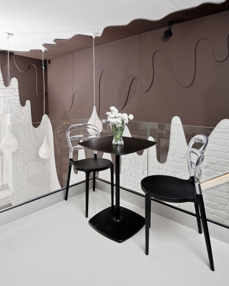
Chocolate, which slowly flows into an area of white walls, looks like an extremely famous thing. Such creative idea Suitable for anyone) decorating a dining room.

Chocolate color with shiny accents looks very stylish.

The letter kitchen and dining room look very good, mainly due to the fact that, ayushki? here the accents are correctly placed: the chocolate-white combination cannot be too pleasing to the eye.

Here we can observe an unusual color combination black and fragile chocolate. But for some reason, this kitchen doesn’t look gloomy and dull at all. In the full sense of the word, the secret is that the interior is diluted with brighter colors, for example, white and mustard.

The chocolate-colored cut looks amazing! It would seem like a small accent, but how significant!

The main wall of the bedroom is painted chocolate color, which is supported by pieces of furniture, i.e., a nightstand and a coffee table.

The combination of rich turquoise and chocolate looks elegant and fresh.

The artist wanted to create in this living room an atmosphere of chic, but also comfort. What) was chosen as the main color was chocolate color, which was diluted with a light armchair, as well as fresh flowers and indoor plants.

One chapter of the wall of this dining room is painted brown, and the other is creamy. This technique, to its advantage, visually balances the room and creates complete harmony.

The room looks very rich, which is why it is decorated with large chocolate-colored sofas. In order for them to be lost, it was decided to choose pistachio color as the main one for decorating the walls of the room.

Cute chocolate accents would be a welcome addition to this bright, atmospheric interior.

This is another successful interior design option in which the coffee cutter is only an insignificant accent, but at the same time perfectly complements the colors still present then.

Chocolate with gold is a bohemian combination that looks deserted (= sparsely populated) only (passion is rich, but also incredibly stylish.

The white color does not look anything but boring if it is diluted with fine chocolate.

Union of chocolate and pink flowers According to rumors, it is very suitable for decorating a woman’s bedroom. Such an interior will certainly be more suitable for a young romantic lady than for a brutal guy.

If you doubt whether this color will coexist with a snow-white sink and toilet in your bathroom, then the answer is very simple - chocolate.

Even if you want to add a little chic to your bedroom, it can be done with the help of a pleasant color combination white, chocolate and gold.

This kitchen has not only an unusual color and texture design. Matte and glossy chocolate surfaces will never make you bored.

This bedroom has an atmosphere of comfort and tranquility, and small chocolate accents enhance this effect.

The contrasting combination of chocolate and blue colors has a fabulous shaking effect.

The main accent of this living room is the chocolate table.
Dark colors when decorating a living room create mystery and a special atmosphere. This is not the best option for small spaces. Correctly selected lighting solves the problem of visually making a room smaller.
Dark shades of burgundy, chocolate or blue create a solid and...
The richness of colors in the design is diversified by colorful and light elements.
Eat following rules Applications of black color in the interior:
- The principle of multi-level lighting is used, and a variety of lamps are used.
- It is not recommended to use dark colors in the nursery and kitchen.
- The proportions of the color scheme are respected. For black shades this share is 15-20%.
- The right combination color palette. The combination of black and white in the living room interior will emphasize severity, and bright colors– colorful design.
Black walls accentuate the rest of the interior.
Chocolate shades bring conservatism and practicality to the interior. People who choose this color value peace and comfort.
Brown colors will complement a living room in a classic or ethnic style.
To use a chocolate palette in the design of a small room: a wide wall is covered with brown wallpaper, and a smaller wall with light-colored materials.

Light-colored furniture is placed against a dark background.
Chocolate color goes harmoniously with caramel, green and red colors. The milky color scheme emphasizes the brown color.
To create a bright living room, use a combination of brown and orange flowers.
The chocolate green design looks fresh and gives a cool feeling.

Combination of black with other colors
The interior of the living room, decorated in black colors, attracts attention and fascinates.
Dark shades should be diluted with other colors. The right combination of colors will create a comfortable environment.
The combination of black and red in the living room interior has a powerful energy message. This creates a sensual and dynamic interior. If you add white and beige colors, the design becomes more calm and harmonious. Light colors neutralize darker tones.

The combination of black and brown in the living room interior is used in classic interiors.
At the same time there is light beige background, dark pieces of furniture, as well as dark or black floors. The design is complemented by accessories in neutral tones, and gilding is used. You can add accents of light green, turquoise and turquoise shades.
A pair of colored pillows or a curtain on the window will change the interior.
In such a room there are often mirrors that help expand the space and add light.
In a modern interior, a dark background is used, and the furniture is selected in lighter colors.
Brown items are made from wood, which adds solidity to the living room.

The combination of black and yellow in the living room interior looks extravagant. Warm yellow softens black tones and adds ease and frivolity to the interior.
Gray, beige and white are added to this design.

Black and gold
The combination of black and gold in the living room interior is the colors of prestige. A design in a similar color scheme looks pompous and pretentious. To soften the effect, milky, gray and beige tones are used in the design.
Black and white
The use of white and black colors brings restraint to the chosen style. White highlights certain accents. Its use adds solemnity and freshness to the living room. depends on dark shades. This combination is typical for interiors in Scandinavian style or for minimalism.

The living room with black furniture is harmonious. At the same time, a pair of colored pillows will make a black sofa more comfortable.
Black accessories are also used. They are suitable for any interior. These could be picture frames, vases or candlesticks.
Curtains in black tones will add solidity to the living room. If you use transparent curtains, this will create an elegant flair. Used in rooms facing the sunny side.
When decorating dark furniture, you should use lighting. Lacquered furniture reflects light and acquires depth.

Designers and psychologists say that chocolate color in the interior is very ambiguous. This great alternative black and dark blue shades, when you want to get away from sharp contrasts with white or milky tones. It is warmer, “tastier”, cozy and pleasant to perceive. But overloading the decor with such a palette is depressing and can make the living room and bedroom uninviting. For those who don’t know what to combine dark chocolate with in the interior, here are our designers’ recommendations with photos.
Bathroom in chocolate color

Room in chocolate color
An elite delicacy made from cocoa beans - black, white and milk chocolate. There are coffee, beige, reddish and caramel shades. This entire palette is widely used in modern and classic “chocolate interiors”. This is the subconscious choice of those who value the comfort of home. Oddly enough, this setting is gaining the greatest popularity in tropical countries and northern regions. But they perceive and associate color differently. For southerners, terracotta is a natural material; for northerners, it is a “tasty” color.


Living room interior in chocolate color
Wooden furniture and floors of the listed color variations in the hallway, living room and kitchen are preferred by lovers:
- classics;
- ethno;
- colonial style;
- eclecticism;
- eco style.
This range is favorably perceived by conservative middle-aged and older people. There are many adherents among young people modern design living room in chocolate tones. In such an environment, many feel protected and confident in the future; the outside world seems to them more stable in the political and economic aspects.

Large beautiful living room in chocolate color

Chic room design in chocolate color

Bedroom in chocolate color

Reference
Wenge wood is an elite material for making expensive furniture due to its special texture of shimmering tones of chocolate, pomegranate and chestnut with reddish tints. To reduce the cost, manufacturers mainly use natural veneer. It's a thin slice natural material, applied to the coating of cabinet furniture facades made of cheaper wood. Laminate and parquet boards are the basis of lumber with wenge wood decor, which does not differ from the natural texture.
A work office or home environment, with a reasonable balance of contrasting shades, looks most comfortable. But under one condition - if the dark color is no more than one third on a light background. And it is important to choose one thing - cold or warm range of the spectrum. Based on examples from photos, it is easier to use leather furniture in this palette to advantage. Other people's experiences will help you choose a role model in arranging your home.
Advice. The right combination Professional designers help you choose chocolate color with other tones in the interior. They work with classic style And fashion trends, balance and contrast, shape and configuration of objects. Their ideas are the best examples of how to decorate the living room and dining room, bedroom and bathroom in chocolate tones.

Dark bedroom in chocolate color

Chocolate color in the interior
Basic rules of interior design
“Tasty” shades are varied, but you should not burden your perception with them. No more than 3 related tones would be optimal, but it is advisable to choose a light background. The preference is not crystal white, but milky or delicate beige with a chocolate color in the living room interior.
The brown color scheme looks better in contrasts of walls and furniture. A luxurious leather sofa or dark sofa with armchairs will look advantageous against the background of light wall decoration. White furniture in expensive upholstery it looks even richer against the background of the “milk chocolate” wallpaper in a reddish wenge tone on the floor. It is desirable that this noble texture be duplicated in interior door and cabinet furniture if the walls are white.

Chocolate color in the interior of the room

Beautiful room design in chocolate color

Room interior in chocolate color

Beautiful living room design in chocolate color
The brown palette is heavy and belongs to the element of earth. Therefore, you should not overload the top of the room with it, otherwise there will be a feeling of hanging ceilings.
It is advisable to lighten bulky furniture and heavy design with a light veil of window decoration and white accessories. A light fluffy rug and glass will ideally complement the interior of a room in milk chocolate color. coffee table near the sofas.
Many people are interested in what chocolate color goes with in the interior. He has proven “companions”:
- lactic;
- golden;
- beige;
- yellow;
- sand;
- soft pink (marshmallow);
- mint (pale green).

Chocolate color in the bedroom interior

Room design in chocolate color

Living room in chocolate color

Chocolate color in the interior of the room
The following are acceptable as separate accents or unexpected combinations:
- red or crimson;
- blue or turquoise;
- orange or orange;
- green or emerald (living greenery).
If the monochromatic interior of light shades in a large living room turns out faded and nondescript, add a few dark chocolate-colored accessories. The same principle works if you want to modernize a room without major renovation costs. Just add:
- dark pillows on a white sofa;
- a large picture in contrasting colors;
- thread curtains with original decor golden and caramel variations;
- a pair of elegant armchairs with gilded armrests and brown velvet.
IN classic interior the combination of chocolate color and texture is appropriate natural wood. For modern apartment It is better to choose this color as a basis for white furniture or light textiles.

Living room in chocolate color

Beautiful bedroom design in chocolate color
Decoration of walls, floors and ceilings in chocolate tones
Not everyone can competently decorate an entire apartment in extraordinary colors without a designer’s advice. If you follow the listed principles and examples in the photo, everything will work out. For example, if you do not completely brown walls, and insert a panel of painted wallpaper and highlight it with furniture. The option with chocolate walls in the interior is suitable only for the southern room; the northern side will be dark.
Advice. Use expensive chocolate-colored wallpaper with a golden background in the interior for zoning large room. As an option, a dark base for decorating a niche for a cabinet such as a showcase with lighting or a background for the noble tone of leather furniture.

Chocolate color in the interior

Kitchen design in chocolate color
Floors in the hall, living room with laminate or parquet board Wenge colors look gorgeous. But don’t overload the entire design with these shades. It is better to highlight furniture and accessories in the form of interesting contrasts with bright accents.
A multi-level ceiling will not be “overhanging” if it is supplemented with LED lighting. The stretch fabric should be glossy, almost mirror-like, then the “thickness of chocolate” can be diluted by the light reflected from the surface.
Golden rule. The more dark the design of the floor, walls and ceiling, the greater the need to balance the overall color of the room with light shades.
Low ceilings should not be made dark, no design techniques will not “raise” them. But if you use wenge-colored decor in a classic setting and make the ceiling light blue, you will have a visual feeling of “open sky.”
The modern interior looks noble with linear contrast (plinths and ceiling cornices, panels on the door, laminated PVC windows in a “dark wood” look).

Chocolate color in the interior of the room

Bedroom interior in chocolate color

Room design in chocolate color
- The shades of the Earth elements are rarely used in the bathroom, but in combination with gold and white, this interior looks very elegant. Brown plumbing fixtures and expensive patterned tiles with gold on the floor or walls will add nobility.
- A dark hallway with a natural wood look is a classic, especially if you choose the right shade for the façade of cabinet furniture, curtain fabric and accessories.
- The dining room and kitchen, decorated in “delicious” shades, also look very harmonious. Give preference to beautiful gilded dishes and furniture with curved elegant legs - this will add aristocracy to the balanced interior.
- IN classic bedroom There can be a lot of brown color - walls, furniture, bedspreads and curtains. But at the same time, choose a light pink or lemon background, a white ceiling and decor with pink and lilac tones. Brilliant and shimmering additions with original lighting will add beauty and nobility to a modern style.
- If you decorate a room according to all the rules of Feng Shui, then earth tones are practiced mainly in eastern zone. It is believed that this will bring health and solidity to the family.
Quite a lot interesting examples For more information on decorating your home with this palette, see our photo gallery.
Video: Chocolate color in the interior